Check out this maturity model. What does it mean to measure the maturity of a technology implementation qualitatively? And how can maturity levels help visualize the current and future states to meet control requirements?
Let's unpack these concepts and show how qualitative measures can enrich the maturity model process, particularly with the use of visualization techniques like bar or radar graphs.
Maturity models serve as diagnostic tools, usually consisting of a sequence of maturity levels that provide a path for improvements. These models are vital for benchmarking and identifying the best practices that need to be implemented for organizational success. In technology implementation, they can gauge how effectively an organization is meeting its control requirements—be it in data security, governance, or software development lifecycle.
The Qualitative Dimension
While numbers and metrics provide a certain level of clarity, they often lack context. Qualitative measurements step in here to provide nuanced insights into otherwise cold data. Through expert interviews, case studies, and scenario analyses, qualitative assessments can address 'how' and 'why' questions that numbers cannot.
One of the powerful ways to present the qualitative aspect of maturity models is through visualization. A bar or radar graph can be used to overlay the current and future states of an organization's maturity levels.
Current State
Imagine a bar graph where the X-axis represents different control requirements like "Data Encryption," "User Access Management," and "Compliance Monitoring," and the Y-axis represents maturity levels from 0 (Non-existent) to 5 (Optimized). The current state can be represented by blue bars reaching up to the current maturity level for each control requirement.
This visualization allows stakeholders to immediately grasp which areas are well-managed and which need improvement. It's not just about the height of the bar but the story behind each bar—which can be enriched by qualitative inputs like expert opinions, employee feedback, and process reviews.
Future State
In the same graph, future state scenarios can be represented by a different color—say, green bars—overlaying or adjacent to the current state bars. These future state bars are not arbitrary but are informed by qualitative measures like scenario planning, risk assessments, and strategic discussions.
The juxtaposition of current and future states in one graph offers a compelling narrative. It shows where the organization aims to be, providing a clear vision for everyone involved.
Utility of Qualitative Maturity Models
Maturity levels, when fleshed out with qualitative measurements, offer more than a snapshot of the present; they provide a roadmap for the future. Visual representations like bar or radar graphs give life to these qualitative insights, making them easy to understand and act upon.
So, the next time you consider assessing your organization’s technology maturity, think beyond numbers. Look at the stories those numbers can tell, and use qualitative measures to fill in the gaps. And don't just keep these insights in spreadsheets and reports—visualize them.
Combine qualitative measures with visualization techniques and build a more meaningful, actionable, and comprehensive roadmap. Aim for a balanced, nuanced, and visually engaging approach to understand the current state and opportunity for improvement.
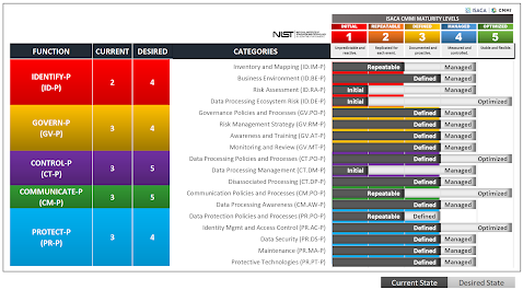
Example Output
Here's a quick assessment of an organization's adherence to the NIST Privacy Framework. The beauty of this method - by the way - is that it's fast and easy to create this chart using qualitative measures. Search for the Privacy Framework spreadsheet under the downloads section if you want a copy of this.